AMEX Corporate Account Reconciliation Platform
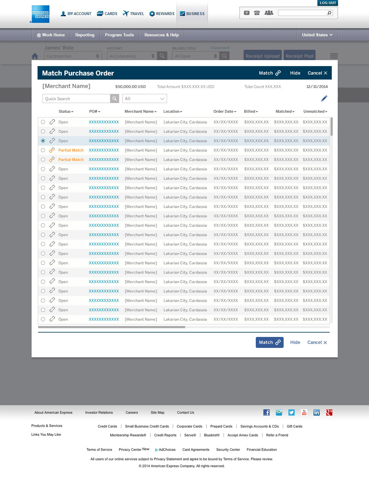
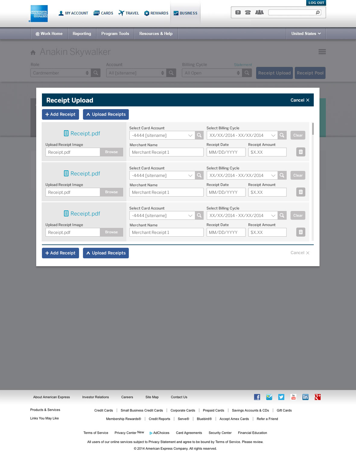
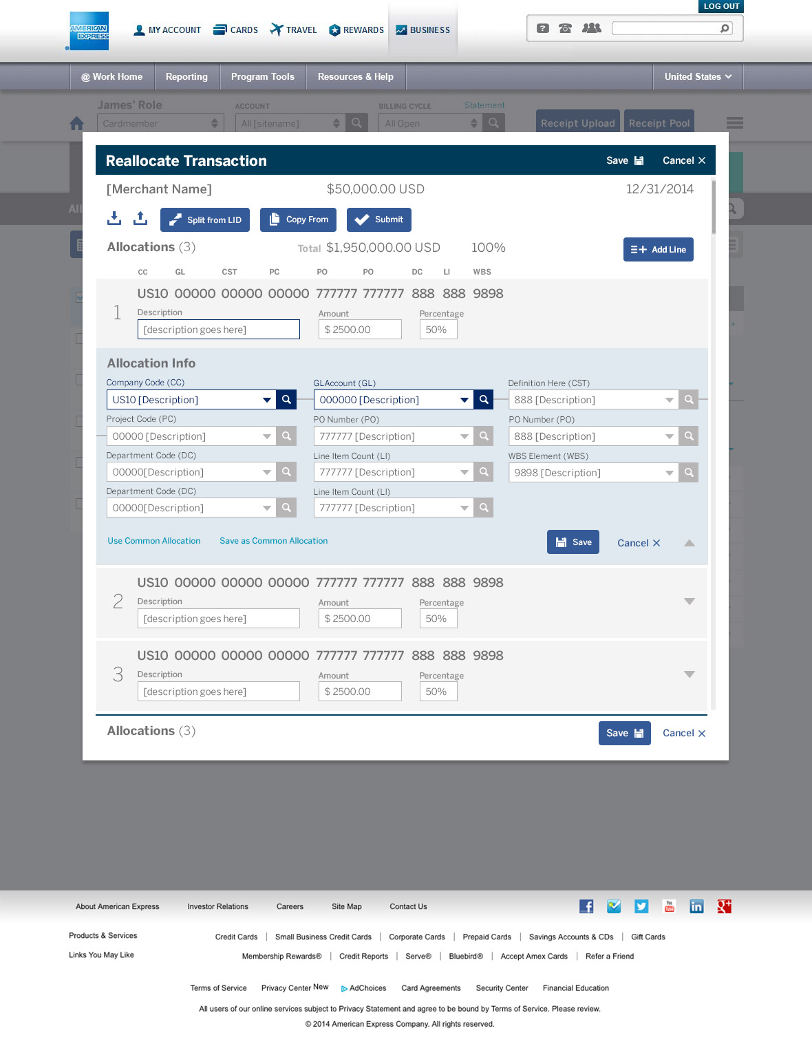
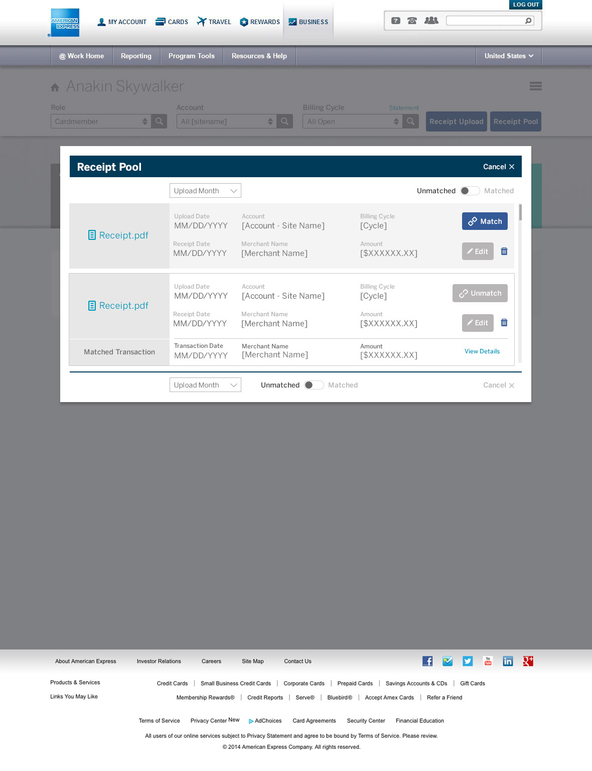
Although tasked with redesigning the AMEX CAR UI into a visually stunning dashboard worthy of the AMEX brand, the team’s UX analysis in conjunction with existing usage data uncovered a host of issues with the application that had to be revisited. Through a rigorous examination of the platform's complex workflows it was determined that the service it provides could be made much smoother and more intuitive. This led to some of its existing workflows and features being rearranged and sometimes even removed, as they were outdated. Streamlining C.A.R's UX also facilitated an improved mobile experience for the platform's first responsive iteration.


Streamlining C.A.R's UX also facilitated an improved mobile experience for the platform's first responsive iteration.